Interactive Weekly Reports For Performance Tracking
Published on: January 31, 2022
Updated on: April 16, 2024
![]() 341 Views
341 Views
Share this article :
![]()
![]()
- Analytics
![]() 17 min read
17 min read

Table of Contents
For decades, traditional written reports have been used by businesses to analyze their performance. However, with the volume of data generated each day today, frequent reporting has become the need of the hour. By 2025, 463 exabytes of data are expected to be generated globally each day.
Companies produce written reports on a monthly, quarterly, or annual basis, but they typically lack the degree of information that marketers need to thrive and remain ahead of their competitors. Here, it becomes imperative to maintain weekly interactive reports.
With COVID-19, interactive weekly reporting has become even more important as companies moved to remote and hybrid working modes.
The importance of interactive weekly reports in performance management cannot be emphasized more. It indeed boosts efficiency and motivates the workforce to stay focused as they keep track of their everyday tasks. Employees get to learn how their job contributes to the overarching aims and objectives of the organization, thus contributing more.
Unlocking Insights: The Power of Interactive Weekly Reports
In today's fast-paced business world, data drives decision-making. It's no secret that static reports are a thing of the past. That's where interactive weekly reports come into play, revolutionizing the way businesses analyze and interpret their data.
Interactive reports allow you to dive deeper into your data, uncovering hidden patterns and trends. They empower you to manipulate and explore the information, enabling a dynamic understanding of what's happening in your business.
Moreover, interactive weekly reports have become even more crucial in the context of COVID-19 and the rise of remote work. With teams spread across different locations, it's essential to have real-time access to actionable insights. These reports bridge the physical gap, enhancing collaboration and enabling better decision-making from afar.
Discover how interactive weekly reports can transform your data analysis process, providing you with the competitive edge you need in today's ever-evolving business landscape. Let's embark on this journey of harnessing the power of data, one interactive report at a time.
Importance of Information in Interactive Weekly Reports
Timely and accurate information is of utmost importance in interactive weekly reports. Such reports provide decision-makers with crucial insights and data in a format that allows for easy analysis and informed choices.
Interactive reports enable decision-makers to access critical data quickly and efficiently. This accessibility ensures that they can gather the necessary information required to make informed decisions in a timely manner. Whether they need to track key performance indicators, monitor progress, or identify areas for improvement, interactive reports provide a comprehensive and dynamic overview.
The significance of accurate information cannot be overstated. Inaccurate or outdated data can lead to flawed decision-making and potentially detrimental consequences. Interactive weekly reports ensure that decision-makers have access to the most up-to-date and accurate information, enabling them to fully understand the current state of affairs and make well-informed choices.
Why Do You Need Interactive Weekly Reports?
Businesses can get a complete picture of key activities that influence various departments and functions with weekly reports. Managers can identify key areas of focus for improving performance management. Employers can keep track of everyday operations, determining where they lack and need to improve. This is beneficial since it aligns with training and development decisions.
Management teams can also utilize these reports to figure out who they should allocate responsibilities to for the coming week and to give better feedback.
The demand for more precise monitoring of performance and tasks has grown as remote work has become a regular feature of the business environment. With an online reporting solution that gives interactive weekly status updates, managers and staff can stay connected even if everyone is working remotely.
What Should A Weekly Report Look Like?
There is no set of rules for what your weekly report should look like. To ensure that you get effective results from maintaining a weekly report, ask yourself the following questions when creating a report:
- What is the current task?
- How much of the assignment has been completed?
- What difficulties are anticipated?
- The task's planned completion date.
- Are the weekly tasks going according to the plan?
Key Elements That Make Weekly Reports A Success
There are no specific rules to follow when creating the perfect weekly performance report because each one will serve a different function. Though you need to keep in mind that a weekly report that is just written to fulfill internal formalities or is only submitted internally and not reviewed, fails to serve its objective, there are a few actions and aspects to follow in order to succeed with weekly reporting.
1. Collecting Current and Old Data
One of the measures you should take when generating your reports is to incorporate both current and old data in your weekly reporting.
On the one hand, knowing how different tactics and tasks are progressing will keep employees on the same page regarding their performance. Also, they will learn from the many barriers they encountered over the week and identify areas of improvement.
On the other hand, collecting previous data will help you detect trends and patterns in your performance, giving you a better knowledge of your company.
2. Setting Weekly Goals
Defining targets and objectives is an important reporting practice. It not only pushes employees to perform better in order to meet their objectives but also allows you to track your progress realistically.
Include KPIs that monitor an annual company objective as well as smaller targets like a weekly quantity of sales or followers to attain, in your weekly performance reports. The main thing to remember here is that not every KPI will accurately represent your aim. So, instead of stuffing your report with irrelevant data, pick the ones that will add value to it.
3. Completed Tasks
If we talk about weekly reporting, one of the major advantages is that it improves communication between managers and their teams. Your weekly performance reports should contain accomplished tasks and objectives for the week. This will allow managers to remain on top of the team's various responsibilities while also keeping track of what has been done in terms of business objectives.
4. Using Data Visualization
Modern weekly performance reports are useful because they are powerful visual tools that can make the reporting system accessible to everybody, regardless of technical expertise. Incorporate a range of interactive graphs and charts into your interactive weekly reports, since these will allow you to put your data into context and extract key insights quickly.
Tools You Can Use for Interactive Weekly Reports
1. Spreadsheets
To begin with, you may use a simple Excel or Google Docs spreadsheet that is loaded with proper reporting format to get you started on your first report. However, completely relying on spreadsheets can be difficult, as it is challenging to handle all the data that grow in both size and volume.
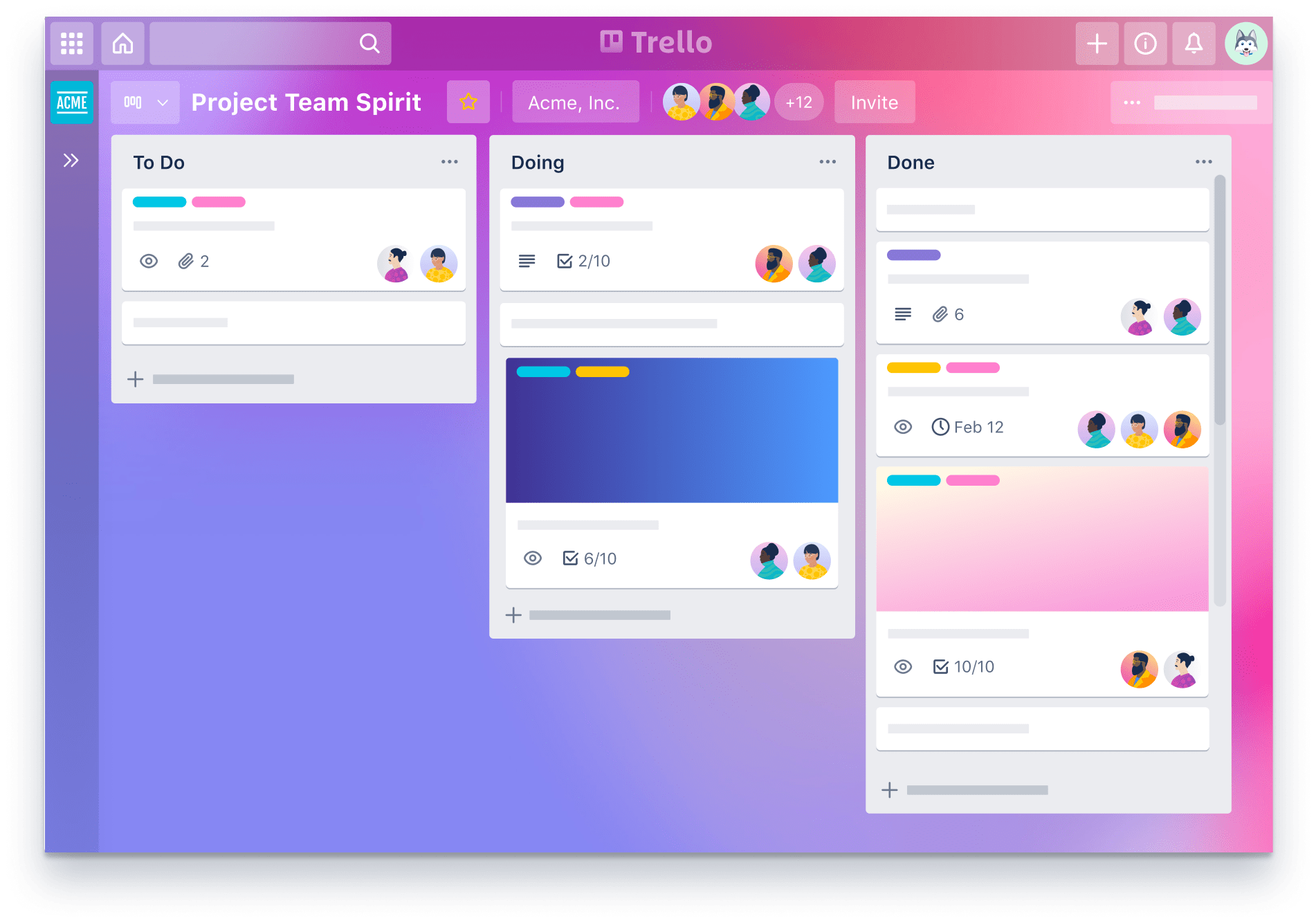
2. Project Management Platforms
Trello and Asana are two leading and common collaborative project management platforms used by companies to keep track of ongoing and upcoming projects. Both Trello and Asana provide great workflow functionality, where the workspace is divided into different sections to organize and view every project’s progress.
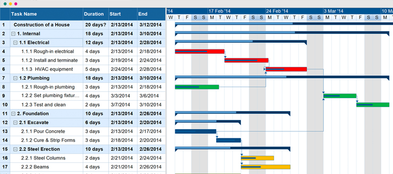
3. Gantt Charts
Gantt charts are a type of graphic status reporting that breaks down projects into smaller parts and arrange them on a schedule with deadlines. As most of us are visual learners, utilizing charts and timelines rather than rows of data to explain how a project is moving is significantly more effective.
Source: https://www.gantt.com/img/gantt-chart-1.jpg
Benefits of Weekly Reports
1. Performance Monitoring
Performance monitoring is one of the most important factors constituted in weekly reports. Business managers need to be in sync with the daily operations performed by the workforce. Interactive weekly reports indicate the pain points in weekly projects, where the managers can stay up-to-date with employee activities and monitor their weekly performance.
2. Sound Decision-Making
Though monthly, quarterly, and annual report sharing is most effective for business success, it in some way doesn’t provide the instant insights that weekly reports can adhere to. With an interactive weekly report, managers can track key performance indicators (KPIs) to simultaneously improve the process of decision-making, while also keeping clients engaged with data. These KPIs can be used to strengthen the progress of your workforce.
3. Enhances Communication
Communication has always been a major shareholder in the success of any business opportunity. With interactive weekly reports, businesses can enhance communication within the workforce and stakeholders. Interactive reporting tools make it easy for companies to view relevant data sources using a single dashboard and ensure that everyone is on the same page when it comes to the latest developments and ventures.
Components of Interactive Weekly Reports
Interactive weekly reports consist of various components that are essential for effectively conveying complex data and trends. The following are some of the key components typically included:
- Charts: Visual representations of data that offer a quick and easy way to understand trends and patterns. Charts can include line charts, bar charts, pie charts, and more.
- Graphs: Similar to charts, graphs provide a visual representation of data. They are particularly useful for showcasing relationships or comparing multiple sets of data.
- Tables: Structured displays of numerical and textual information that allow for easy comparison and reference. Tables are commonly used to present raw data in an organized format.
- Visualizations: Interactive elements that transform data into meaningful visuals, such as heat maps, scatter plots, and geographical representations. Visualizations help users comprehend complex information at a glance.
By incorporating these components into interactive weekly reports, businesses can present data in a visually appealing way, making it easier for stakeholders to analyze and understand important trends and insights.
COVID-19 Impact on Interactive Weekly Reports
The relevance of interactive weekly reports has been greatly emphasized during the COVID-19 pandemic. As the world grapples with the ongoing crisis, the need for accurate and timely information has become paramount.
Interactive weekly reports offer a unique way to visualize and analyze data related to COVID-19. With the virus spreading rapidly and impacting various regions differently, it is crucial to have a comprehensive understanding of infection rates, vaccination progress, and location-specific trends.
By leveraging interactive reports, individuals and organizations can easily grasp the severity of the pandemic in different areas. Visualizations such as maps, charts, and graphs enable users to identify hotspots, track the spread of the virus, and assess the effectiveness of containment measures.
Furthermore, interactive weekly reports can highlight the progress of vaccination campaigns, providing insights into the percentage of the population vaccinated and the distribution of vaccines across different demographics. This serves as a valuable tool for policymakers and healthcare professionals to make informed decisions and allocate resources effectively.
Additionally, interactive reports can help uncover hidden patterns and trends in COVID-19 data. By visualizing data over time, it becomes possible to identify fluctuations in infection rates and detect emerging clusters or outbreaks. This information enables governments and organizations to implement targeted interventions and adjust strategies as needed.
During this challenging time, the seamless communication of information is crucial. Interactive weekly reports facilitate collaboration and communication among various stakeholders. By providing a centralized platform for sharing data and insights, these reports enable real-time updates and tracking, ensuring that the most up-to-date information is available to all.
In summary, interactive weekly reports play a vital role in understanding and combating the impact of COVID-19. Through their ability to visualize and analyze data related to infection rates, vaccination progress, and location-specific trends, these reports offer valuable insights for decision-making and resource allocation. By leveraging data visualization, health metrics, and real-time tracking, interactive reports enable effective collaboration and communication in the face of a global pandemic.
Leveraging Data Visualization for Interactive Weekly Reports
Data visualization plays a pivotal role in enhancing the effectiveness of interactive weekly reports. In a world flooded with extensive amounts of data, visual representations enable users to quickly grasp complex information and draw actionable insights. By transforming raw data into interactive charts, graphs, and maps, data visualization brings life to your weekly reports.
Let's explore some examples of various data visualization techniques that are suitable for weekly reports:
- Heatmaps: A heatmap provides a visual representation of data using color variations. By using gradients to represent intensity, heatmaps allow the audience to easily identify patterns, trends, and outliers.
- Line charts: Line charts are excellent for showing trends over time. Whether it's tracking sales data, website traffic, or customer behavior, line charts make it simple to comprehend fluctuations and spot significant changes.
- Interactive maps: Interactive maps display data geographically, making it easy to understand regional variations. By incorporating filters and tooltips, users can explore specific areas and gain deeper insights.
These data visualization techniques not only make your weekly reports visually appealing, but they also improve understanding, interpretation, and decision making. The visual representation of data allows stakeholders to quickly identify key indicators, compare different metrics, and take actions based on the insights obtained.
Incorporating Health Metrics into Interactive Weekly Reports
In the midst of the COVID-19 pandemic, the importance of health-related metrics in interactive weekly reports cannot be overstated. These reports play a crucial role in providing up-to-date information and insights on the state of public health, helping decision-makers and stakeholders make informed decisions.
Within the context of COVID-19, tracking health metrics allows us to monitor the impact of the virus and make data-driven decisions to mitigate its effects. Hospitalization rates, vaccination coverage, and the impact on various age groups are just a few of the metrics that can be included in these interactive reports.
- Hospitalization Rates: Incorporating hospitalization rates in interactive weekly reports helps us understand the strain on healthcare systems and identify areas that require additional resources or support.
- Vaccination Coverage: Tracking vaccination coverage allows us to monitor the progress of vaccination efforts and identify any gaps or challenges that need to be addressed.
- Impact on Various Age Groups: Examining the impact of COVID-19 on different age groups helps us identify vulnerable populations and tailor interventions and resources accordingly.
By incorporating these health metrics into interactive weekly reports, we can create a comprehensive and dynamic tool for understanding and responding to the evolving landscape of the pandemic. Real-time data visualization and analysis allow us to identify trends, patterns, and potential areas of concern, empowering us to take proactive measures and allocate resources where they are needed most.
Interactive Updates and Real-Time Tracking
Interactive weekly reports offer a unique advantage with their ability to provide real-time tracking and updates. This feature allows users to access the most up-to-date information at any given moment, ensuring that decision-making is based on the most accurate and current data available.
With traditional weekly reports, decision-makers often have to rely on outdated information, which can lead to inefficiencies and ineffective decisions. However, interactive reports eliminate this problem by continuously updating data in real-time.
Real-time tracking is particularly valuable in fast-paced industries where timely decision-making is crucial. Whether it's monitoring sales figures, project progress, or market trends, having access to real-time updates enables businesses to respond quickly to changing circumstances and make proactive decisions.
Moreover, interactive weekly reports facilitate a deeper level of engagement by allowing users to interact with the data themselves. Users can manipulate visualizations, filter information, and drill down into specific details, gaining a comprehensive understanding of the data and uncovering valuable insights.
The significance of up-to-date information cannot be overstated when it comes to making effective decisions. Whether it's identifying emerging trends, analyzing project performance, or assessing the impact of strategic initiatives, having access to real-time updates enables decision-makers to make informed choices.
Interactive weekly reports empower decision-makers to stay ahead of the curve and respond to challenges promptly. By providing real-time tracking and updates, these reports enable businesses to adapt quickly to changing circumstances and seize opportunities as they arise.
Collaboration and Communication through Interactive Weekly Reports
Interactive Weekly Reports play a crucial role in fostering collaboration and communication within teams. By providing a dynamic and engaging platform for data sharing and analysis, these reports enable teams to work together seamlessly towards shared goals.
Empowering Collaboration:
- Team members can actively contribute to the report by adding their insights, comments, and suggestions. This collaborative approach encourages knowledge sharing and facilitates the exchange of ideas.
- With the ability to highlight specific data points or trends, interactive reports enable teams to pinpoint areas of concern or improvement, sparking discussion and encouraging problem-solving.
- By offering real-time updates, interactive reports ensure that all team members stay informed about the latest developments, leading to a stronger sense of unity and teamwork.
Promoting Transparency and Alignment:
- Interactive reports can be easily shared and accessed by team members, promoting transparency and alignment across the organization.
- With the use of interactive visuals, such as charts and graphs, complex data sets can be presented in a digestible format, allowing team members to quickly grasp key insights and make informed decisions.
- Through the inclusion of interactive elements, such as clickable links or embedded documents, team members can access additional information or supporting documentation directly from the report, eliminating the need for multiple communication channels.
By utilizing interactive weekly reports as a collaboration and communication tool, teams can streamline their workflows, enhance productivity, and foster a culture of open communication and transparency. With everyone on the same page, teams can work together more effectively towards achieving their objectives.
Agile Project Management and Interactive Weekly Reports
In today's fast-paced business environment, agile project management has become the go-to approach for organizations seeking to accelerate their project delivery and enhance collaboration. At the heart of agile project management lies the concept of continuous improvement, iterative decision-making, and adaptability. Interactive weekly reports align perfectly with these principles, making them an invaluable tool for agile teams.
Facilitating Iterative Decision-Making
Interactive weekly reports offer real-time insights and data visualization that allow teams to make informed decisions quickly. With the ability to track progress, identify bottlenecks, and monitor key performance indicators, agile teams can pivot and adjust their strategies at any given moment. This iterative decision-making process ensures that the team is continually adapting, learning, and improving, ultimately leading to better outcomes.
Adapting Quickly to Changing Circumstances
In today's dynamic business environment, change is the only constant. Agile project management encourages teams to embrace change and respond quickly. Interactive weekly reports support this by providing a comprehensive view of project progress, including milestones, tasks, and dependencies. With this information at their fingertips, teams can easily identify potential roadblocks and adjust their approach accordingly. By leveraging interactive reports, agile teams can stay nimble and address changing circumstances more effectively.
Moreover, interactive weekly reports promote transparency and collaboration among team members. By providing a centralized platform for information sharing and discussion, these reports enhance communication and foster a culture of collaboration. Agile project management thrives on effective communication, and interactive reports play a crucial role in facilitating this.
Final Thoughts
A weekly report should be such that it not only gives you and the supervisors an overview of your current performance but also historical data from previous weeks. As a result, you will benefit from an efficient decision-making process based on facts rather than just human intuition.To learn more about performance tracking and data analysis, visit our blog section.
Frequently Asked Questions
Interactive weekly reports for performance tracking are dynamic reports that provide a comprehensive overview of key metrics and performance indicators for a specific time period, typically updated on a weekly basis. These reports allow users to interact with the data, explore trends, and gain insights to inform decision-making.
Interactive weekly reports are beneficial for performance tracking because they provide timely and actionable insights into business performance, facilitate data-driven decision-making, encourage engagement with stakeholders, and support ongoing monitoring and optimization efforts.
Interactive weekly reports may include a wide range of data relevant to the organization’s goals and objectives, such as sales figures, website traffic, conversion rates, customer engagement metrics, marketing campaign performance, and operational KPIs.
Interactive weekly reports differ from static reports in that they allow users to explore and interact with the data in real-time, using features such as filters, drill-down capabilities, interactive charts and graphs, and customizable views to analyze trends and extract insights.
Top Related Blogs

The Ultimate Guide to Direct Google Analytics 4: Everything You Need to Know
In the early days of digital marketing, the mantra was simple: without a website, you barely exist. Fast forward to today, and a similar truth echoes – without analytics, your online presence is like driving without a roadmap. Enter the transformative power of Google Analytics 4, a game-changer shaping the way businesses understand and optimize […]

Power Up Your Website with the Best Web Analytics Tool
In today’s digital age, understanding and utilizing web analytics has become essential for businesses seeking to thrive online. Web analytics refers to the collection, measurement, and analysis of data related to website usage and visitor behavior. This invaluable tool provides businesses with critical insights into their website’s performance and helps them make data-driven decisions to […]

User Behavior Analytics: Unveiling Insights for Optimal Performance
Understanding user behavior is a crucial aspect of any successful digital strategy. User Behavior Analytics (UBA) is a powerful methodology that provides invaluable insights into how users interact with your website or application. By analyzing user actions, preferences, and patterns, UBA allows businesses to make data-driven decisions that lead to improved user experience, increased conversions, […]